Bike Counter Data Shows Clear Covid Spike
We’ve all seen increased cycling activity during Covid lockdowns and heard about the surge in demand for bicycles and related equipment. But it’s interesting to see some hard data that precisely measures cycling activity, even if it’s only a snapshot from six locations around Australia.
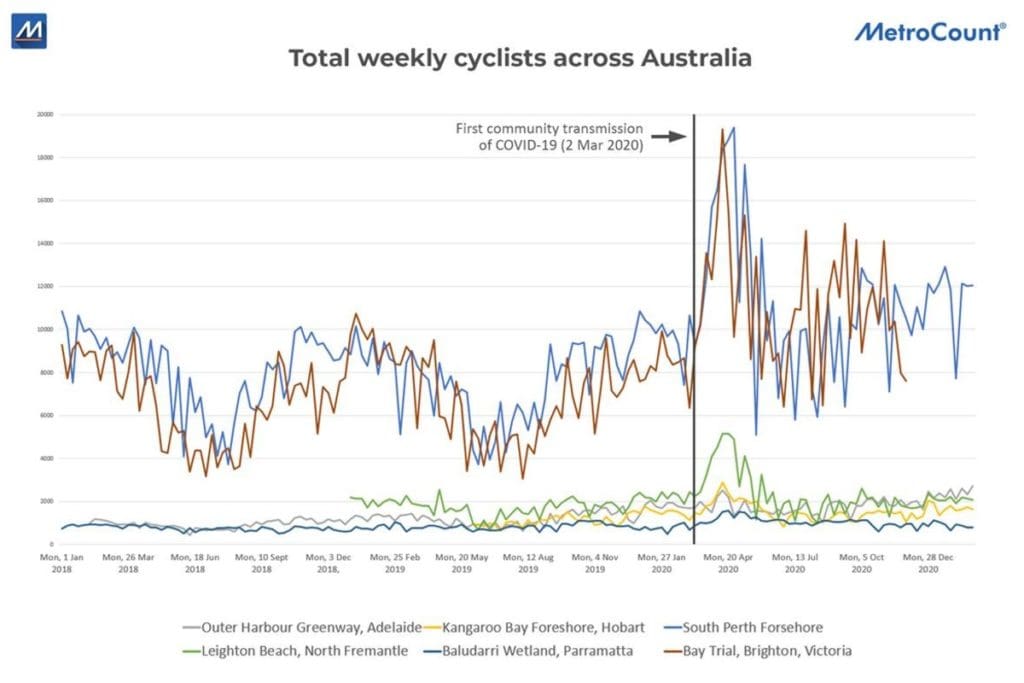
The two charts accompanying this story relate to the same six bike counting locations. These are automated counting stations that operate 24/7.
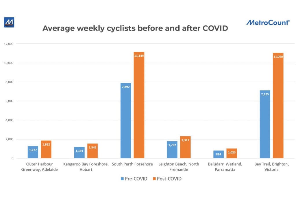
The first chart, ‘Average weekly cyclists across Australia before and after COVID’ shows the average weekly bike counts at six locations. In all cases, you can see that the orange, post covid bar, is higher than the blue, pre-covid bar.
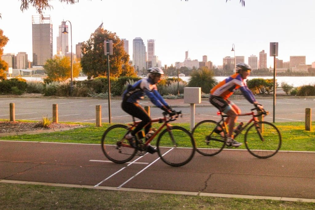
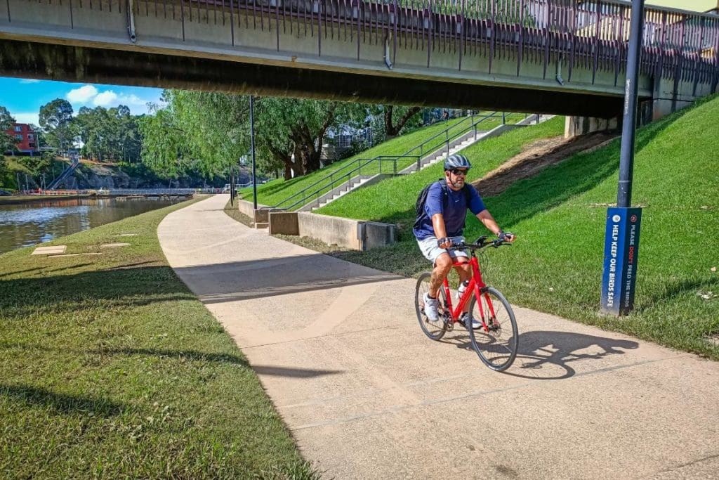
The two locations that look most dramatic are the South Perth Foreshore and Bay Trail, Brighton. That’s because they’re by far the most heavily ridden of the six sites. There are photos of the exact counting locations, plus the Parramatta one, accompanying this article.
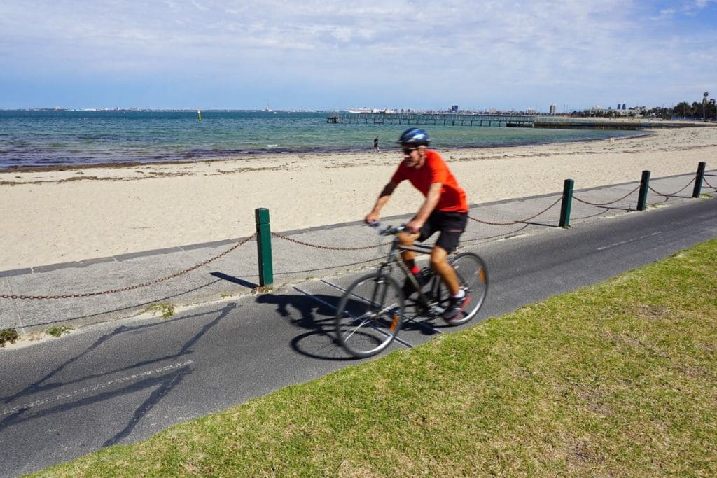
In fact, the Bay Trail in the Melbourne suburb of Brighton shows the highest average growth both in terms of absolute numbers, an increase of 3,933 riders per week, and percentage increase, at 55.2%. Perhaps this is because Melbourne had the most covid cases and locked down hardest for longer than anywhere else.
Second in percentage terms is actually the Outer Harbour Greenway in Adelaide at 45.8% increase, followed by the most popular path in the sample, the South Perth Foreshore, at 41.2% increase. Rounding out the six were Hobart at 29.5%, Fremantle at 29.3% and Parramatta at 25.9% increase.
The second chart, entitled ‘Total weekly cyclists across Australia’ shows the actual count, week by week. It’s interesting to see that in all cases, the initial surge in April 2020 was the largest, then things plateaued for the rest of 2020, but at a higher level than the previous years.
We would like to that the City of Charles Sturt (Adelaide), Clarence City Council (Hobart), City of South Perth, City of Fremantle, City of Parramatta and VicRoads for releasing their data and thanks to MetroCount for providing the charts and images.
This article was first published in the Micromobility Report.